While landing page designs may vary, they all serve one purpose: guiding visitors to the next step in their buying journey. It's not just about the brand aesthetics; it's about adhering to proven best practices. In this blog, we'll share the key strategies for landing page design that every business should know.
Here's what to expect:
- The Principles of Landing Page Design
- The Secrets to Good Landing Page Structure
- Key Page Elements for Landing Page Designs
- 3 Examples of Good Landing Pages
6 Principles for Good Landing Page Design
1. Design for Usability
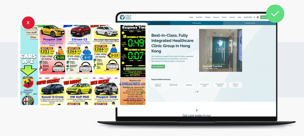
In the fast-paced digital world, users don't always have the patience to sift through dense content. Landing pages should be immediately digestible, akin to billboards, rather than detailed brochures. With a clear visual hierarchy and defined areas, users can quickly find what they're looking for, enhancing their experience. Clear headers, bullet points, and concise paragraphs ensure users can quickly grasp the essence of your message.
2. Conversion-Centric Design
Whether you aim for newsletter sign-ups or webinar registrations, your landing page design should be tailored to drive these actions. High-contrast CTAs, testimonials for credibility, and concise value propositions all contribute to a design that urges users to take action.
3. Mobile First
More people browse on mobile than on desktops. Designing with a mobile-first approach ensures optimal functionality across devices. With Responsive Web Design (RWD), elements adapt seamlessly, offering a consistent experience regardless of screen size.
.jpg?width=1200&height=578&name=img1%20(3).jpg)
4. Test and Improve
A/B testing allows you to continually refine your landing page design, optimising for better conversion rates and user satisfaction. You can test different page elements like colours and CTAs to improve user experience and performance.
5. Design to Solve Problems
Every great landing page design starts with a problem in mind. Whether it's driving sign-ups, boosting sales, or collecting feedback, your design should offer a solution. By addressing specific user needs, your landing page becomes more than just a pretty face—it becomes a tool for success.
6. Communicates Messages Effectively
Every landing page should prioritise succinctness. Your value proposition should be evident almost instantly, ensuring visitors grasp your offering within mere seconds of landing on the page.
The Importance of Good Landing Page Structure
The layout you choose for your landing page will depend on the goals and content of your landing page. In essence, it's the blueprint of your landing page. By organising content logically and intuitively, users can effortlessly navigate through the page, enhancing their experience and increasing the chances of conversion.
F-Pattern Layout
Studies have shown that when users browse online content, their eyes often move in an 'F' pattern. This means the most critical information should be placed at the top, with secondary information following horisontally or vertically. Adopting the F-pattern in your landing page design aligns with natural reading behaviors, ensuring essential content isn't overlooked.
Z-Pattern Layout
For landing pages with fewer content blocks, the Z-pattern layout can be effective. As the name suggests, the user's gaze starts at the top left, moves horizontally to the top right, then diagonally to the bottom left, and ends at the bottom right. This layout is ideal for landing pages that aim to guide users through a process or story.
Simplistic Layout
Simplicity is key. By minimising options and streamlining your landing page design, you can guide users to the desired action more efficiently. Simplifying choices on your landing page can reduce decision time and improve conversions.
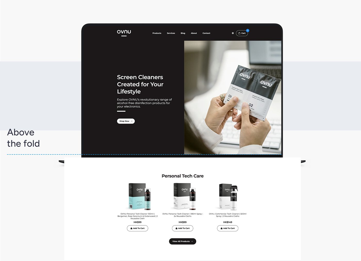
The Fold Layout
"The fold" refers to the portion of the landing page visible without scrolling. While the debate continues about its significance, "the fold" — the point where users have to scroll to see more content — remains a vital aspect of landing page design. Placing essential elements such as CTA’s above the fold ensures immediate visibility and engagement.
Important Page Elements for Landing Page Designs
Below are important elements that you must consider when designing your landing page.
Brand and Colour Consistency
Consistency fosters trust. Your brand is unique, and your landing page should reflect that. Maintaining consistency in brand elements, especially colours, ensures a cohesive experience. Users who recognise familiar brand elements feel more at ease and are more likely to engage. It reinforces brand identity and fosters trust among visitors. When someone lands on your page, they should immediately recognise it as part of your brand universe. Maintaining brand consistency across your landing page design strengthens brand recognition and trust, whether it's a specific colour palette, typography, or logo placement.
Colour Signals
Colours speak louder than words. They evoke emotions and drive actions. For instance, red often signifies warnings or urgency, green represents success or affirmation, and blue is universally recognised for hyperlinks. By understanding and utilising these colour signals, you can guide user behaviour and optimise conversions.
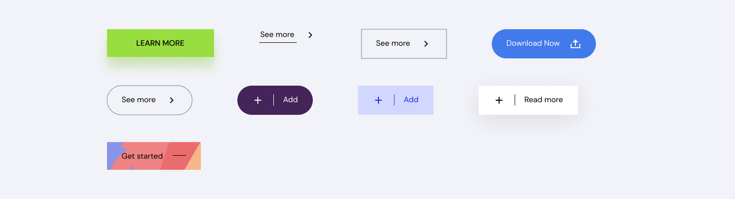
Call to Action
A CTA is the heartbeat of any landing page. It's the prompt, the nudge, that pushes users to act. But it's not just about the message; the color of your CTA button plays a pivotal role. For instance, a green button might signify 'Go' or 'Proceed', while red could mean 'Stop' or 'Exit.' Choose a color that aligns with your message and stands out without clashing with the overall design.
Web Content Accessibility Guidelines (WCAG)
Inclusivity is paramount. WCAG ensures that your landing page is accessible to everyone, including those with disabilities. Adhering to these guidelines not only broadens your audience reach but also enhances user experience and ensures compliance with global standards. Not to mention, Google uses accessibility as a factor that affects SEO.
Images/Videos
A picture is worth a thousand words, and in the digital world, possibly more. High-quality images and videos can elevate your landing page design, offering visual appeal and context. They break the monotony of text, engage users, and can effectively convey complex messages succinctly. At the same time, it’s important not to overdo it and overwhelm the user.
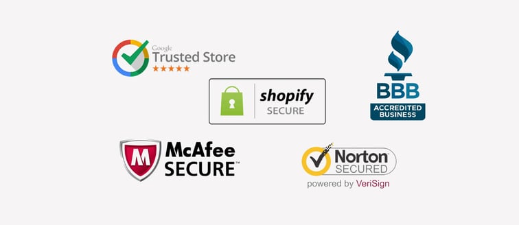
Trust Symbols
Trust is the cornerstone of online interactions. Incorporating symbols like testimonials, certifications, or security badges can instil confidence in users, assuring them of your credibility and authenticity.
Forms
Forms allow you to gather valuable insights, be it user feedback, email sign-ups, or queries. A well-designed form is concise, intuitive, and aligns with the landing page's aesthetic, ensuring users are more inclined to engage. An important note we have found is that forms should be placed above the fold. After conducting various A/B testing of different versions of landing pages, we have found that pages with forms above the fold have consistently performed better in converting.
Examples of Good Landing Page Designs
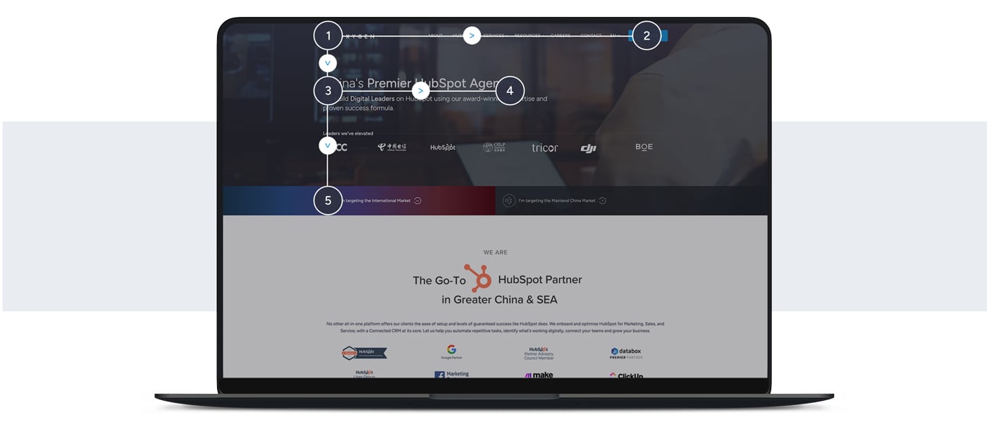
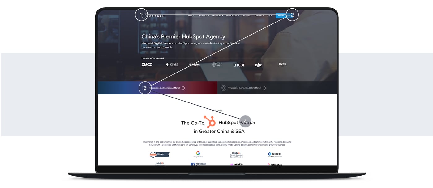
1. Oxygen
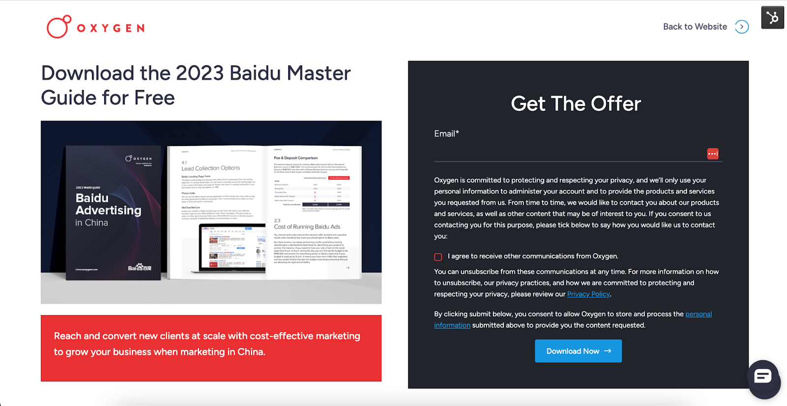
Why This Landing Page Works:
-
Colour: The landing page example effectively utilises colours that align with the brand's tone and identity, creating a visually cohesive experience that instills trust in the visitors.
-
Simplicity: The landing page example highlights the importance of simplicity by presenting information clearly and concisely. It avoids overwhelming customers with excessive content and clutter, maintaining a streamlined and focused approach. This allows visitors to quickly understand the key message and benefits offered.
-
CTA: The landing page example excels in providing a prominent and easily noticeable Call-to-Action (CTA) that stands out from the rest of the page elements. The CTA is strategically placed, using contrasting colours, which encourages visitors to take the desired action. This clear and visible CTA enhances the conversion potential and guides users towards the intended goal.
2. Airbnb
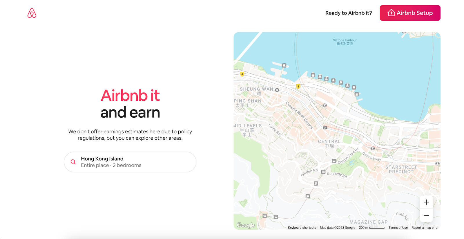
Why This Landing Page Works:
-
Colour: The landing page example successfully incorporates colours that align with the brand's tone and identity, creating a sense of cohesiveness and trust. The carefully selected colours evoke a positive emotional response and reinforce the brand's credibility, ultimately fostering trust with the visitors.
-
Simplicity: The landing page example demonstrates an understanding of the importance of simplicity by presenting information in a concise and organised manner. By avoiding excessive content and overwhelming the customer, the page maintains a clean and uncluttered design, allowing the key message to shine through and ensuring a pleasant user experience.
-
Benefits Clearly Shown: The landing page example effectively communicates the benefits to the customer, particularly regarding how much they will get paid. By presenting this information in a clear and straightforward manner, without overwhelming the user, the page effectively highlights the value proposition and motivates visitors to take action. This approach helps potential customers understand the advantages they stand to gain, increasing the likelihood of conversion.
3. Express VPN
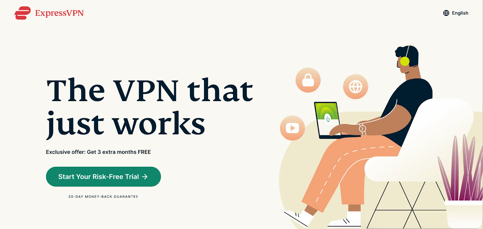
Why This Landing Page Works:
-
Simplicity: The landing page example maintains simplicity by avoiding an excessive amount of information that could overwhelm the customer. By presenting only the most important and relevant details, the page allows visitors to quickly understand the value proposition without distractions, leading to a more focused and user-friendly experience.
-
Image: The landing page example utilises images, such as the symbol of a lock, to reinforce the trustworthiness of the brand. By incorporating visual elements that are commonly associated with security and reliability, the page effectively communicates a sense of trust and credibility to the visitors, enhancing their confidence in the brand.
-
Offer: The landing page example presents an irresistible offer of 3 free months that creates a sense of urgency by emphasising its limited availability. By highlighting the offer, the page taps into the psychological principle of scarcity, compelling visitors to take immediate action to avoid missing out. This creates a sense of excitement and motivation, increasing the likelihood of conversion.
Balancing landing page aesthetics with functionality while catering to diverse user behaviours can be challenging. But with a keen understanding of design principles and user psychology, achieving a landing page that looks good and converts is entirely within reach. If you're eager to elevate your digital presence with a professional who can ensure all the elements and principles we mentioned above are followed effectively, explore our expert web design services.