UAE/GCC
 International
B2B website design, especially in Asia, is challenging to get right. Finding the right balance between engaging, informative and conversion-focused (often for multiple local markets) are some of the main challenges. Most new B2B websites in Asia launch simply as a new digital facade to the business with little thought into how to attract and convert leads. However, when done right, your website can be your best salesperson - not to mention generating a positive ROI!
At Oxygen, we understand what makes a quality B2B website. Here is a roundup of the 10 website designs that have successfully adhered to some of the top principles for building a high-performance B2B website for the Asian market in 2023.
1. DMCC: Best Eye-Catching Visuals
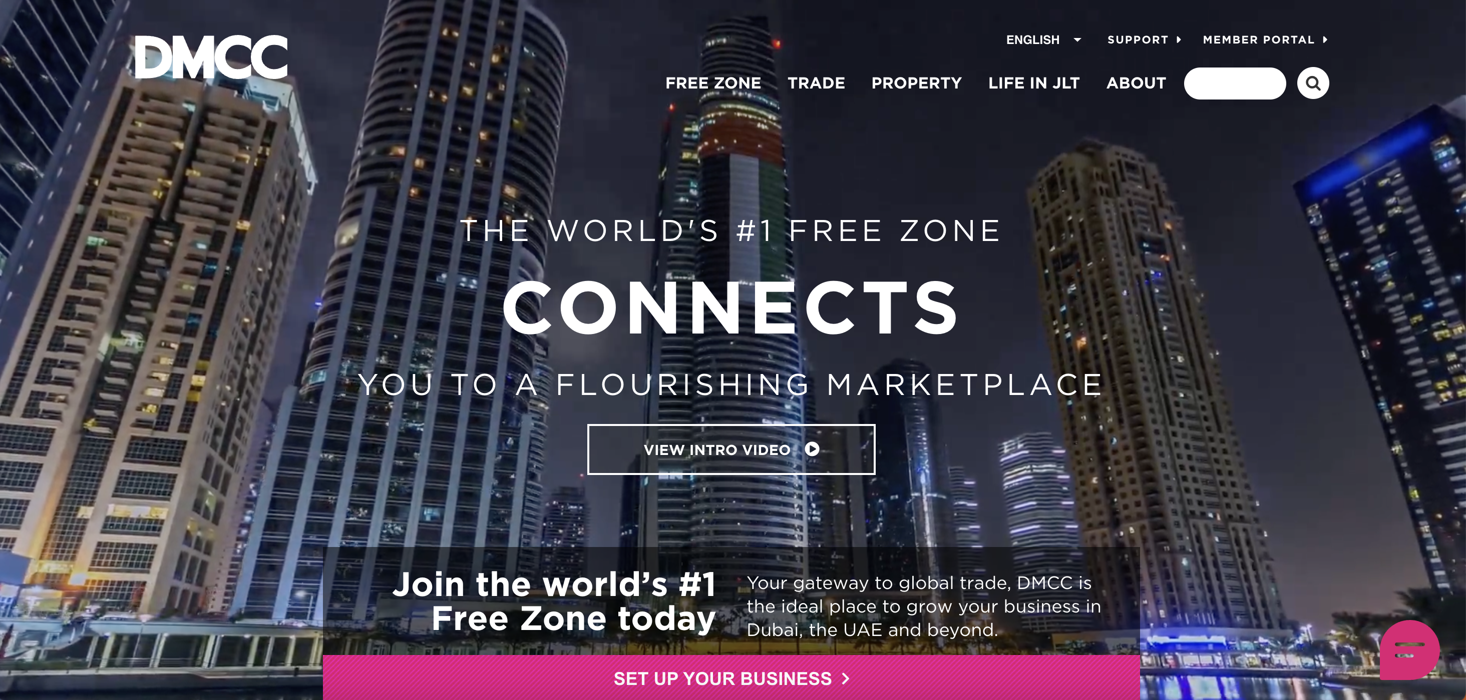
By striking the perfect balance between engaging visuals and user experience, DMCC's website showcases the value of a well-thought-out B2B website design. DMCC's website is a prime example of a design that successfully combines stunning visuals with exceptional user experience. The site effectively communicates the futuristic aspect of its business through the use of dynamic, handcrafted animated icons and graphics. This creates a sense of visual diversity and movement, giving visitors a glimpse into the future of business within the DMCC Free Zone.
A standout feature of the DMCC website is its well-placed calls-to-action (CTAs) throughout the site. These CTAs not only encourage visitors to explore the process of setting up a company in the DMCC Free Zone, but they also provide easy access to essential information about commodities, the community, the business setup process, and more. The seamless integration of these CTAs ensures that potential clients are guided through the website in a way that maximises engagement and conversion.
Website Tip: Have a clear CTA.
Maximizing your conversion rates heavily relies on your website's calls-to-action (CTAs) effectiveness. It is paramount to adhere to a crucial B2B web design best practice by featuring a single, prominent CTA on your homepage. This approach ensures clarity and focus, guiding your visitors towards the desired action and optimizing your conversion potential.
2. Navigator Insurance: Clear Conversion
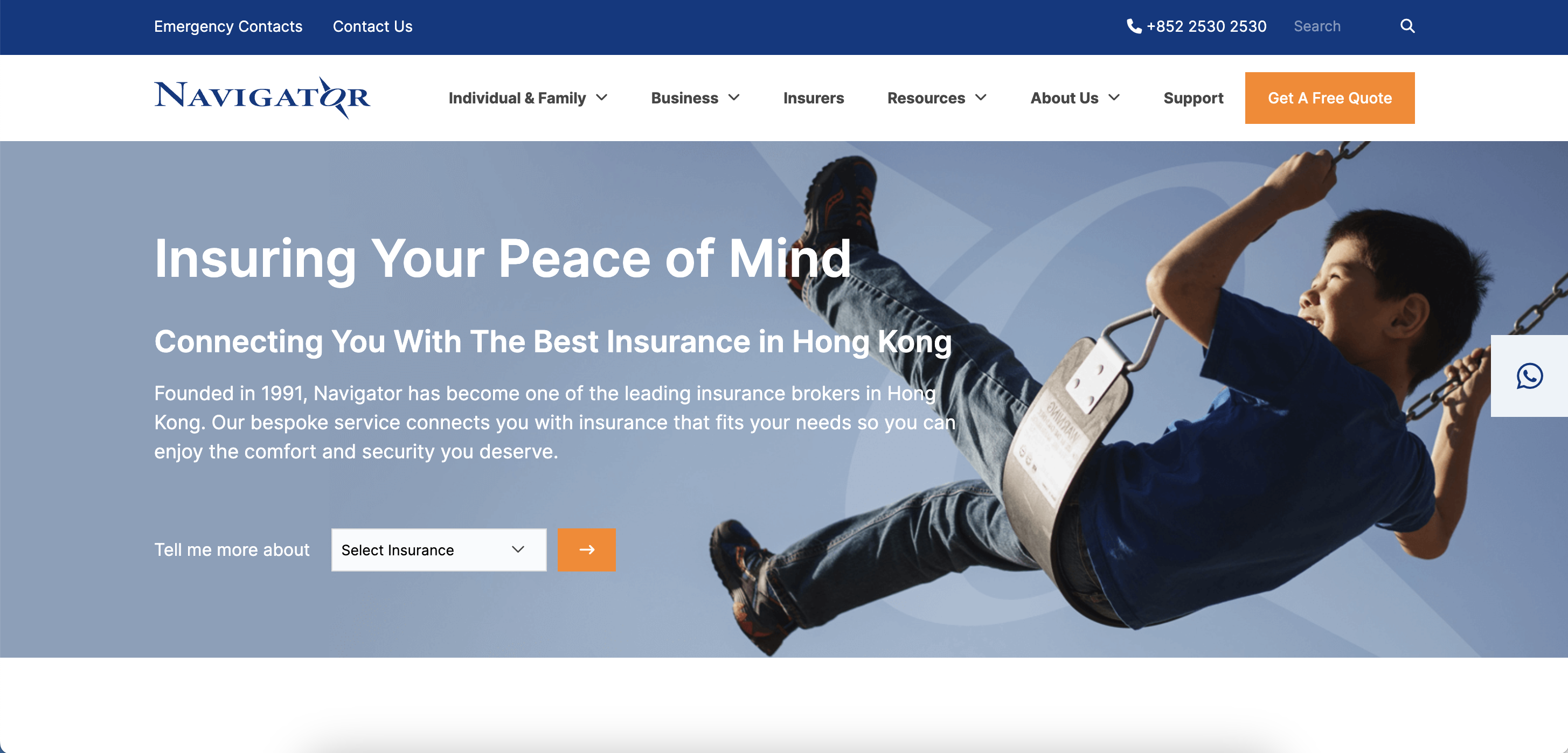
Navigator Insurance understands the importance of effective and clear navigation. By achieving effective and straightforward navigation on your website, you are able to provide a seamless user experience. Well-designed navigation menus and intuitive site structure enable visitors to quickly and easily find the information they need, reducing frustration and increasing engagement. By also utilising clear labels, logical grouping, and intuitive placement of navigation elements contributes to a user-friendly interface.
In addition to website navigation, a key element that sets Navigator’s website apart is its leverage of a WhatsApp button. The Whatsapp feature can enhance communication and engagement with your audience. Integrating WhatsApp into your website lets visitors connect with you directly, providing a convenient and familiar channel for inquiries, support, or sharing content. This feature facilitates real-time interactions, builds trust, and boosts customer satisfaction.
Website Tip: Clear Conversion Points
Identifying and optimising clear conversion points is essential for driving desired actions and achieving business goals. By strategically placing prominent CTAs, forms, or buttons (like Whatsapp) throughout your website, you guide visitors towards specific actions such as purchasing, subscribing to a newsletter, or requesting a quote. Clear and compelling conversion points with persuasive messaging and noticeable visual cues help increase conversions and maximise the impact of your website.
3. Pigeonhole: Best Use of Chatbot
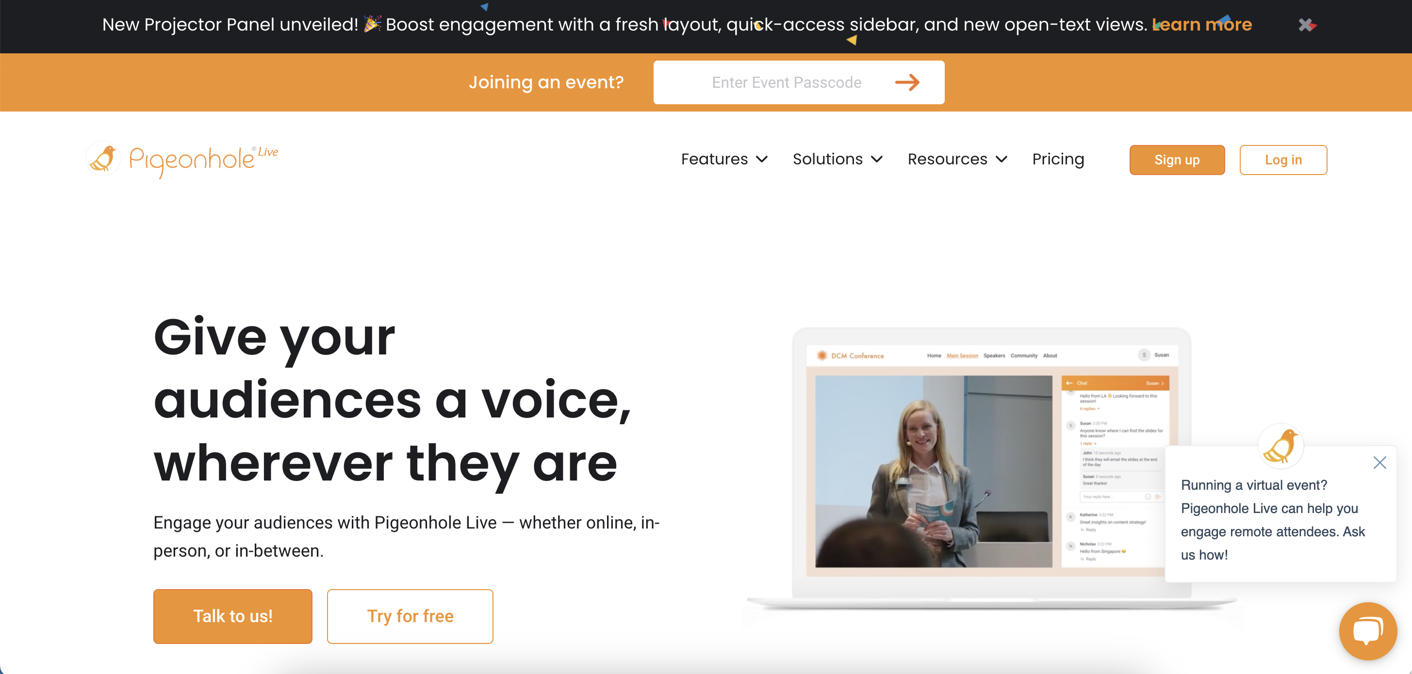
Pigeonhole’s website design is an excellent example of chatbot utilisation. Placing a chatbot on your website can significantly enhance user experience and engagement. A well-designed chatbot provides instant assistance, answers common queries, and guides visitors through their journey. By offering personalised interactions, a chatbot creates a sense of real-time support, helping users find the information they need quickly and efficiently. Additionally, a chatbot can collect valuable data and insights about user preferences and behaviours, enabling you to optimise your website and tailor your offerings to better meet their needs.
Another important design feature is their use of videos. Videos are another powerful tool for engaging website visitors. Videos have the power to captivate audiences, convey information effectively, and evoke emotions. By including well-produced and relevant videos like Pigeonhole's, you can communicate your brand message, demonstrate product features, or share informative content in a visually appealing and engaging format.
Website Tip: Trust Symbols
Establishing trust with your website visitors is crucial for driving conversions. One effective way to instil confidence is by prominently displaying trust symbols throughout your site. For example, Pigeonhole lists their key clients on their page. Incorporating recognised trust symbols, such as key clients or customer testimonials, can significantly impact your credibility and reassure visitors of your commitment to their satisfaction.
4. OT&P: Best Use of Knowledge Base
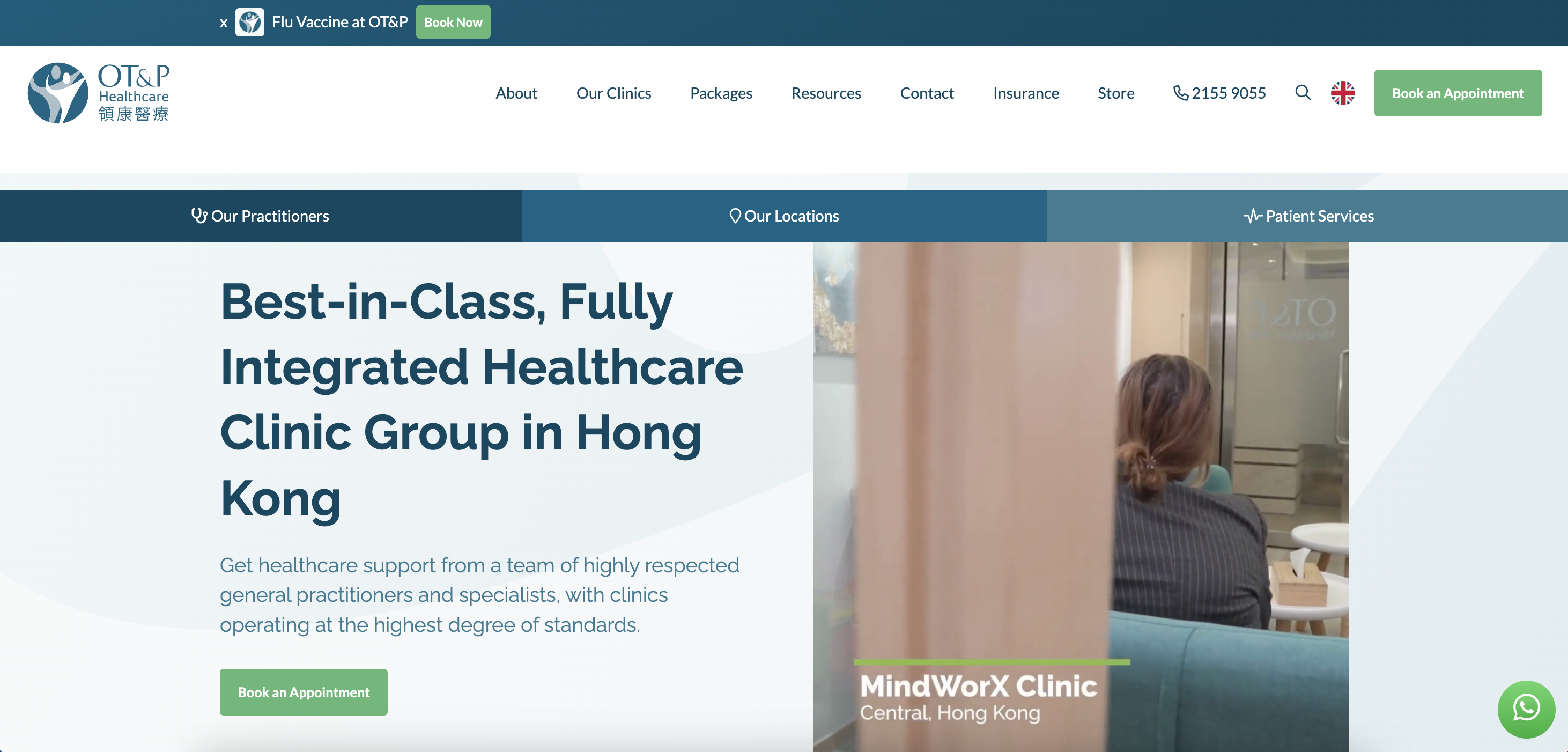
OT&P (technically B2C but similar to B2B in that inbound works extremely well) has incorporated everything from great aesthetics, UX, performance and inbound marketing through quality content and SEO. The website's state-of-the-art knowledge base demonstrates OT&P's commitment to providing informative and educational content to their audience, establishing the company as a thought leader in their field.
OT&P’s new website highlights its credentials, experience and trustworthiness by using real images of their clinics and employees throughout the whole site. Many doctors and patients have commented that the new OT&P website is the ‘best looking and most user friendly’ clinic website they have ever seen.
OT&P's website redesign by Oxygen goes to show what can be achieved when time and expertise are applied to redesigning a website, leading to their Hubspot Impact Award of 2019 for website design.
Website Tip: Using Company Images
Utilising authentic company images on your website is a powerful tool for building trust and credibility with your audience. This is more important for businesses like health clinics as the genuine and authentic visuals of your team or office can create a personal connection, allowing visitors to see the human side of your business. By showcasing authentic images, you demonstrate transparency and authenticity, giving potential customers a glimpse into your company's culture and values.
AI images can still also give the human touch. When correctly utilised, AI-generated images can show a side of your business that may be difficult or expensive to showcase through real-life photography. For example, AI-generated images can illustrate specific medical procedures or treatments, helping patients understand the processes involved and building trust in the clinic's expertise. Visualising intricate medical procedures through AI-generated images can simplify complex or graphic concepts, making them more accessible and informative for patients with limited medical knowledge.
To read more on how Oxygen helped OT&P revamp their entire website, click the button below:
5. Manufacturing Transformation Group: Best Use of Navigation

Manufacturing Transformation Group (MTG) is a manufacturing consulting organisation that advises on and executes manufacturing initiatives. Their website utilises practical engineer-style principles to attract highly valuable leads and fits perfectly with their target audience. Having helpful information on your site can encourage more people to visit it. MTG utilises this efficiently to change their visitors into frequent visitors and eventually become clients, members, or subscribers. We consider MTG's website's resources the most crucial component of its intuitive design.
The website employs a straightforward and user-friendly navigation structure, allowing visitors to easily access information and quickly find their needed services. A prominently placed, easily identifiable navigational service button enhances user experience by directing visitors to relevant sections with minimal effort. MTG’s website includes tailored location-specific pages, offering content relevant to specific geographic markets. This feature enables visitors to access region-specific information, case studies, and insights, helping to build trust and establish local expertise.
Website Tip: Navigational Service Button
Implementing a clear and intuitive navigational button to select the desired service on your website is a smart strategy for enhancing user experience and driving conversions. Providing a prominent and easily identifiable button empowers visitors to quickly explore and find the specific service they want.
6. Dyson: Best Visual Hierachy
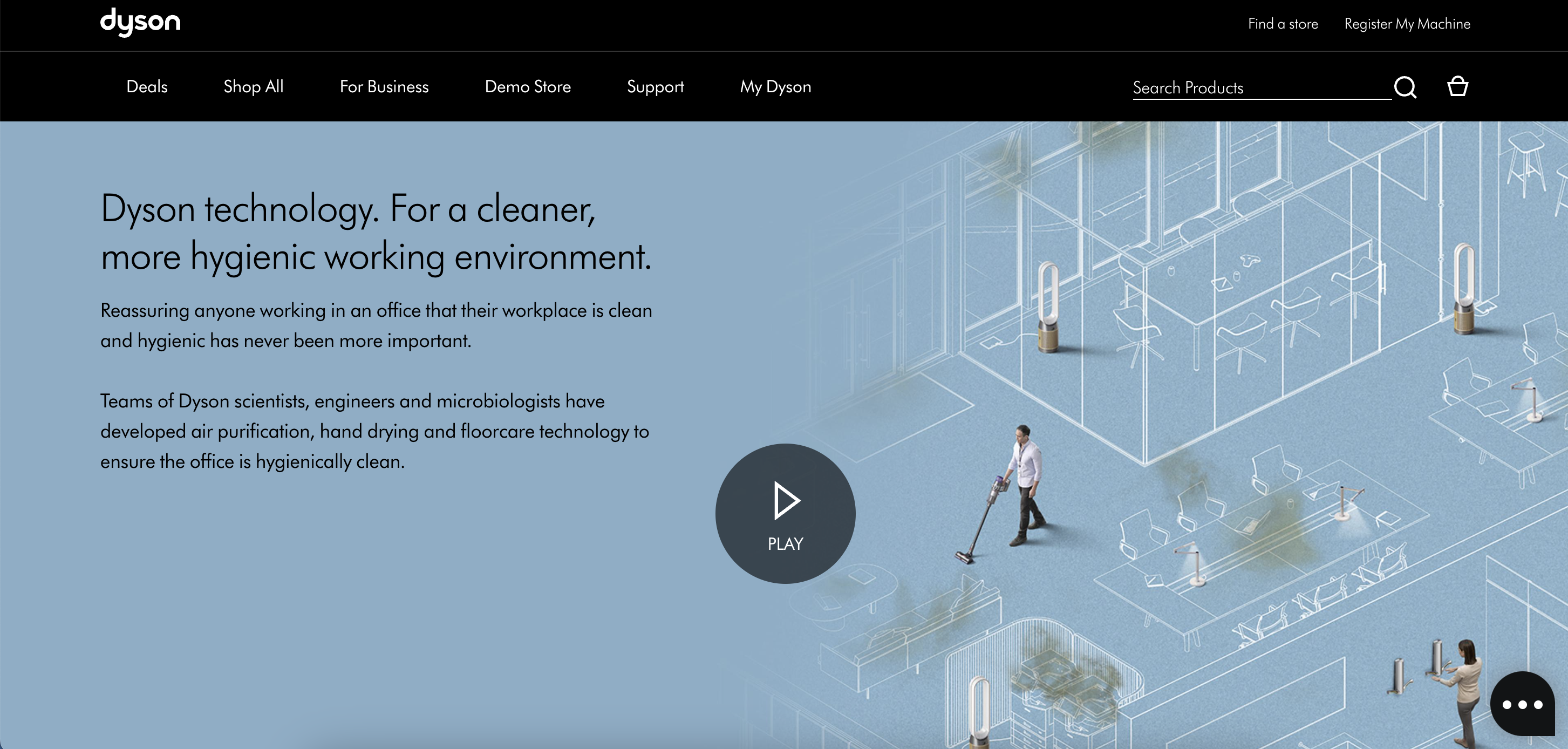
Minimal web design focuses on arranging elements in a way that maintains a clear visual hierarchy and avoids distractions. Dyson has achieved this beautifully through their flat web design, strategic use of white space, and a limited color palette. These elements work together to create a clean, visually appealing site that effectively communicates OVNU's value proposition and services.
Website Tip: Include Product Images
By showcasing clear and detailed product images, you provide your audience with a visual representation of your offerings. This allows them to assess your products' quality, features, and functionality, helping them make informed buying choices.
7. Additive3D: Best Use of Language
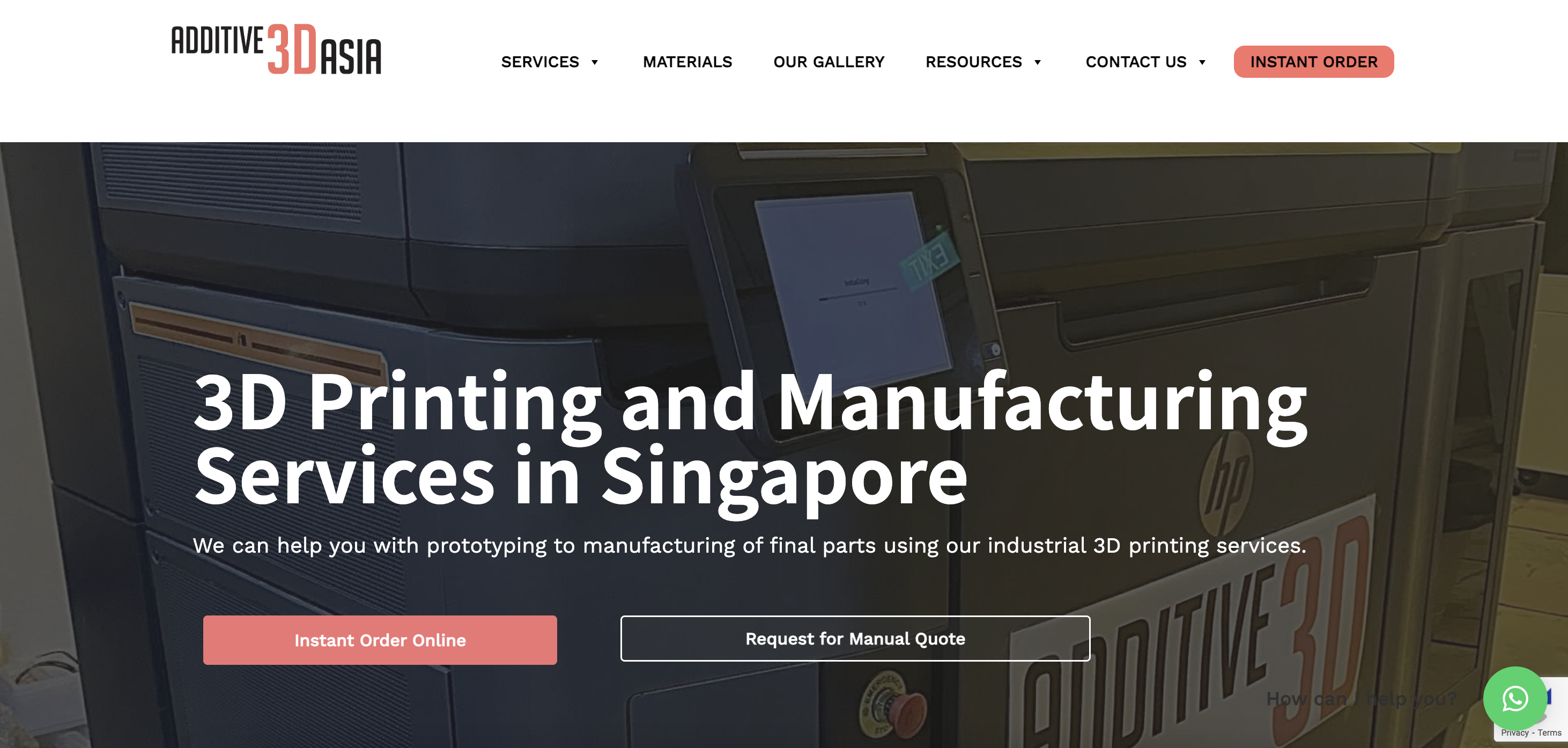
Getting bogged down with technical details and a lot of industrial jargon can turn away many leads who really just want to know “what is it going to cost me?”. Additive3D Asia is a good example of a 3D printing company website that solves this problem very well. While technical details in 3D printing can be complex, Additive3D Asia keeps the jargon on its website to a minimum and instead focuses on their instant quotation system and 3D printer booking service.
Website Tip: Colour Coded CTA's
Integrating colour-coded calls-to-action (CTAs) on your website is an effective strategy for capturing attention, guiding user actions, and increasing conversions. By utilizing carefully selected colours for your CTAs, you can create visual cues that prompt visitors to take specific steps.
8. DJI: Best Use of Product Display
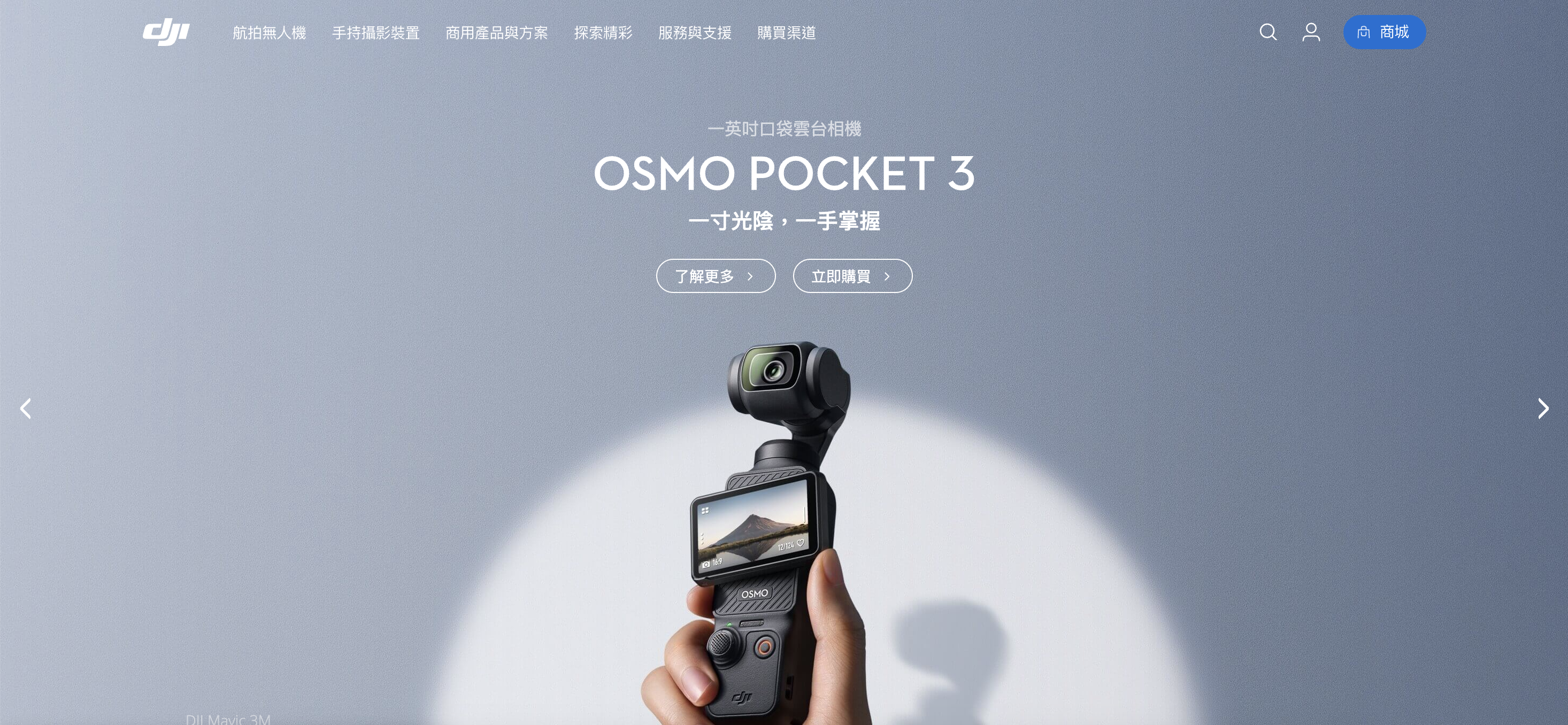
As the market leader and household name in easy-to-fly drones, DJI's website lets their products speak for themselves. Their list of high-quality images, video demonstrations and animations on their website showcases their successful range of top-quality products and services on offer. Their clean user experience really increases customer engagement on their website. DJI also understands the importance of localising their content for local audiences with a huge list of supported language options.
Website Tip: Minimalistic Design
Adopting a minimalistic approach on your web pages can have a profound impact on user experience and conversions. By keeping the design clean, uncluttered, and focused, you create a visually appealing environment that allows visitors to engage more effectively with your content and take desired actions.
9. Ververica: Best Use of Consistent Branding
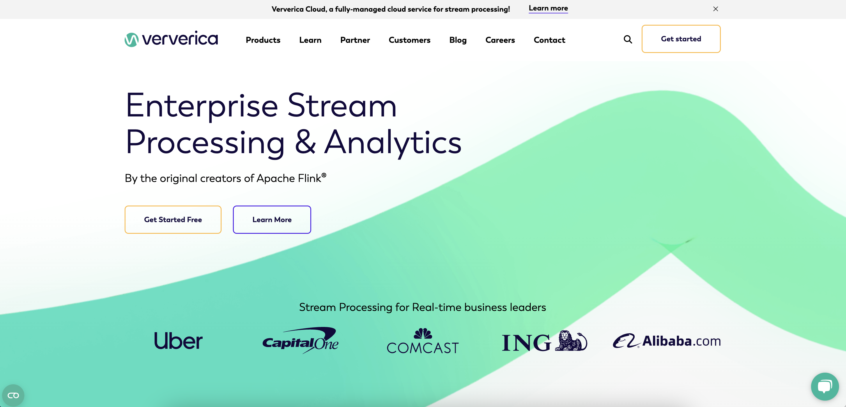
Your visitors should be able to instantly identify what exactly your company does and your unique selling point. Upon entering Ververica's site, their value proposition is clear and concise. Their small statements like 'Real-time business leaders' make a bold, impactful impression on visitors.
Their consistent branding and colour scheme throughout the website make it easy for users to navigate around the page to find exactly what they are looking for and increase readability.
Website Tip: Double CTA
Two call-to-action (CTA) buttons effectively cater to visitors at different decision stages. The 'Get Started' CTA appeals to users ready to engage immediately, streamlining their journey towards conversion. Meanwhile, the 'Learn More' CTA targets those still exploring, providing them with additional information and nurturing their interest. This dual-CTA approach balances the needs of decisive users and those requiring further details, enhancing the overall user experience and conversion potential of the site.
10. Oxygen: Best Showcasing of Value Proposition
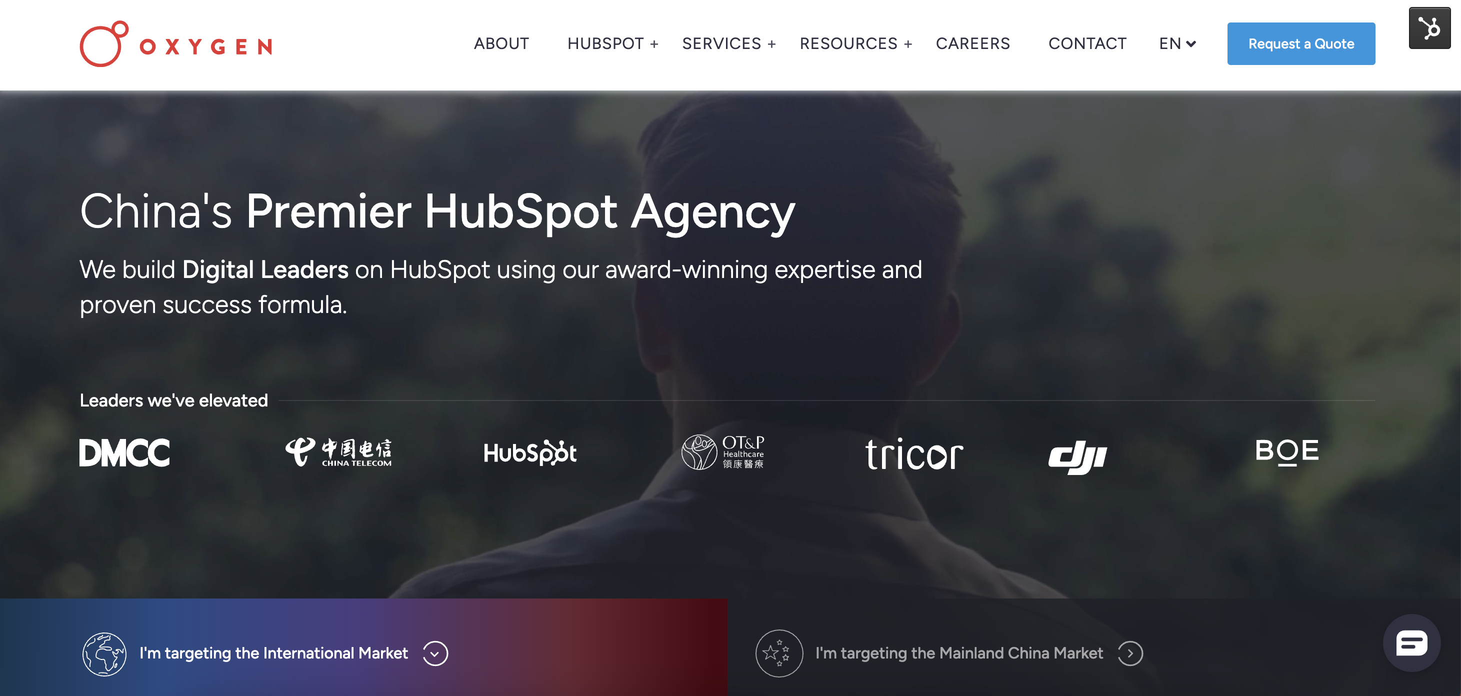
Now, we don't want to toot our own horn too loudly (okay, maybe just a little), but we believe our website deserves a spot on this list. As China's Premier HubSpot Agency, we've designed our website to provide a clear value proposition and showcase our expertise in the industry.
Our website is designed with user experience in mind. Above the fold, the H1 clearly states our position as "China's Premier HubSpot Agency," immediately conveying our unique selling point to visitors. Our extensive content library includes pillar pages for each of our core service offerings, providing valuable information and demonstrating our knowledge in the field.
To further establish trust, we've included case study pages and testimonials from satisfied clients. These trust signals not only showcase our successful track record but also give potential customers the confidence to choose us as their partner.
The Oxygen website embodies the best practices in B2B website design, providing a clear value proposition, extensive content, trust signals, and a user-friendly conversion funnel. We might be a little biased, but we think it's a great example of what a B2B website should look like!
Website Tip: Utilise Case Studies
Incorporating case studies on your website is an effective strategy for building trust, showcasing your expertise, and driving conversions. Case studies provide tangible evidence of your previous successes and serve as powerful testimonials that resonate with potential customers.
Tips for Creating a Great B2B Website in Asia
Building a standard B2B website with a list of services and an 'about us' page is easy, but creating an award-winning B2B website that acts as your best salesperson is a real challenge, especially in the Asian market. B2B websites in Asia need to not only attract, educate, and convert leads with shorter attention spans but also cater to the unique requirements of the region. Let's explore some tips for creating a successful B2B website in Asia.
1. Language and Localisation
Asia is home to a diverse range of languages, making localisation a crucial aspect of B2B website design. Providing content in local languages and ensuring proper translation can improve user experience and increase the website's reach. If you plan on marketing to the Chinese market, which is completely different from all other markets, detailed buyer persona information specific to that market is imperative for success.
2. Mobile-first Design Approach
With mobile internet usage significantly higher in Asia compared to the western world, B2B websites in Asia should prioritise mobile-first design to cater to the majority of users accessing the site via smartphones and tablets.
3. Search Engine Optimisation (SEO) for Regional Search Engines
While Google dominates the global search engine market, some Asian countries have their popular search engines, such as Baidu in China. Optimising the website for these regional search engines can improve visibility and reach among local users.
4. Content and Design Tips
Great website experiences are intuitive and have everything your visitor is looking for, plus more. The key to creating this is understanding the problems to solve for your visitors or potential visitors. Invest in quality content over advertising, as inbound marketing has proven to be more effective when it comes to ROI. Ensure that your value proposition is clear, especially on the main pages. Make sure that your navigation is clear, easy to use, and makes sense to someone who doesn't know your business. It should also be 100% functional on all devices.
5. Finding an Agency and Planning Your Launch
The cost of building a B2B website varies per agency. Choosing a smaller agency from a lesser-developed country for a lower cost might seem like a good idea at first, but it could lead to delays and endless revisions.
Creating a successful B2B website in Asia is achievable with the right approach and the right team. By focusing on language and localisation, mobile-first design, regional SEO, and selecting the right agency, you can build a website that truly stands out in the Asian market.
Looking for an experienced partner for website design in Asia? Speak with one of marketing experts to find out.


%20inside%20it.png?length=910&name=glowing%20glass%20cube%20represents%20a%20Unified%20HubSpot%20Portal%20housing%20several%20smaller%20icons(representing%20branding,%20marketing%20assets,%20reporting%20and%20CRM)%20inside%20it.png)